Logo & Label Design for a Natural Health Product
AUX Design created a crisp, professional logo, brand guide and product label design for Pacific Bone Water. This natural health product needed branding that balanced its herbal roots with clinical trust.
Designer
Amber [AUX Design]
Client
Chris [Pacific Bone Water]
Services
Logo Design
Brand Guide
Product Label Design
Pacific Bone Water
Pacific Bone Water is a topical pain liniment created with organic and wild crafted herbs and made in small batches in British Columbia, Canada. They needed a logo and brand system that felt trustworthy, clean and professional. Something that could stand confidently in a clinical setting while still reflecting the natural, herbal origins of the product.
The Challenge
Pacific Bone Water is designed for health practitioners, athletes and health-conscious consumers. So the brand and packaging needed to communicate both clinical credibility and natural integrity. The goal was bold, clean and clinical. Designed to feel like a trusted therapeutic product – not a cosmetic.
Another challenge was adhering to Health Canada’s strict labelling regulations for Natural Health Products.

Logo Concepts are Presented
The Objective
Maintain a bold and trustworthy presence while introducing an accurately detailed poplar bud icon.
The logo design process focused on balancing clarity with character. Explorations included:
- Symbol-forward concepts with subtle wave, monogram and poplar bud references
- Typography-driven marks that rely on strong letterforms and spacing
- Encapsulated icon variations placed within a droplet or circle shape for extra structure
Initial Icon Design
This icon was hand-drawn from a reference photo of real poplar buds, creating a design that is both distinctive and authentic. Because accurate poplar bud symbols are rare, this mark stands apart as a truly custom creation rather than a piece of clip-art or a generic illustration.

Icon Variations
The initial icon design worked well both on its own and within contained shapes. Several icon variations were presented, paired with different font choices and orientations.
The Logo is Finalized
We ultimately chose a direction built around bold, trustworthy typography paired with a strong, structured icon that feels at home in both clinical and natural-health contexts.
This logo combines the custom poplar bud icon within an outline of a water droplet with strong, stacked typography. Different logo orientations offer flexibility for labels, packaging, digital use and beyond.
Primary / Stacked Logo: This is the main logo and will be used whenever possible. It works well on print materials, packaging, and key brand touchpoints where there’s enough space for the full lockup to be clearly visible.
Horizontal Logo: The horizontal logo is ideal for website headers, email signatures, signage and any short or wide layout where the stacked version feels too tall or cramped.
Icon Only: The icon on its own is perfect for social media profile images, favicons, watermarks and small-scale applications where the full logo would be too much.
Monogram: The monogram is a compact, typographic mark with a simplified icon. It works well for subtle branding, embroidery, stamps and small spaces. Ideal in situations where a minimal, refined version of the logo is needed. It also prevents detail from being lost in smaller applications.
Primary
Horizontal
Icon Only
Monogram

Typography
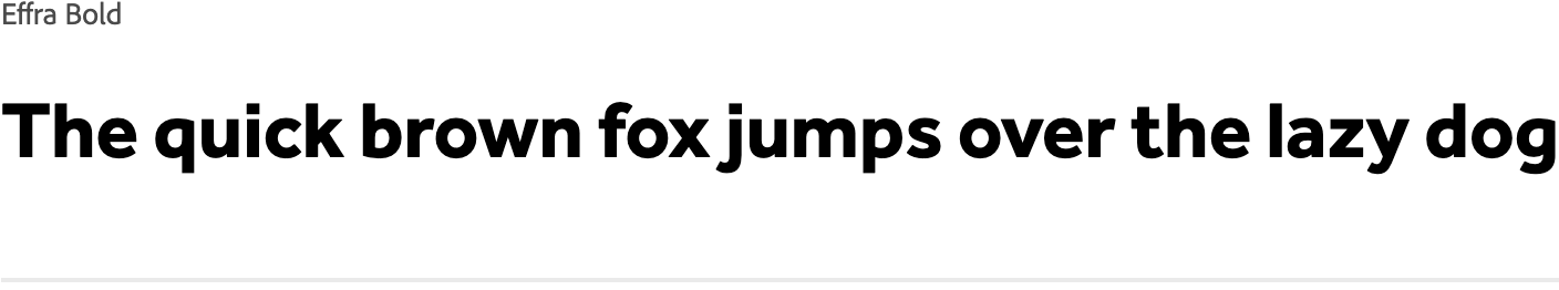
Effra Bold was selected for the logo because of its clean geometry and bold presence. It provides the clarity and professionalism needed for a clinical-leaning brand while offering enough character to feel modern and approachable.
To complement the logo and branding, Figtree is recommended for use across digital and printed materials. Its open shapes and excellent legibility make it ideal for label text, product instructions, website copy and more.
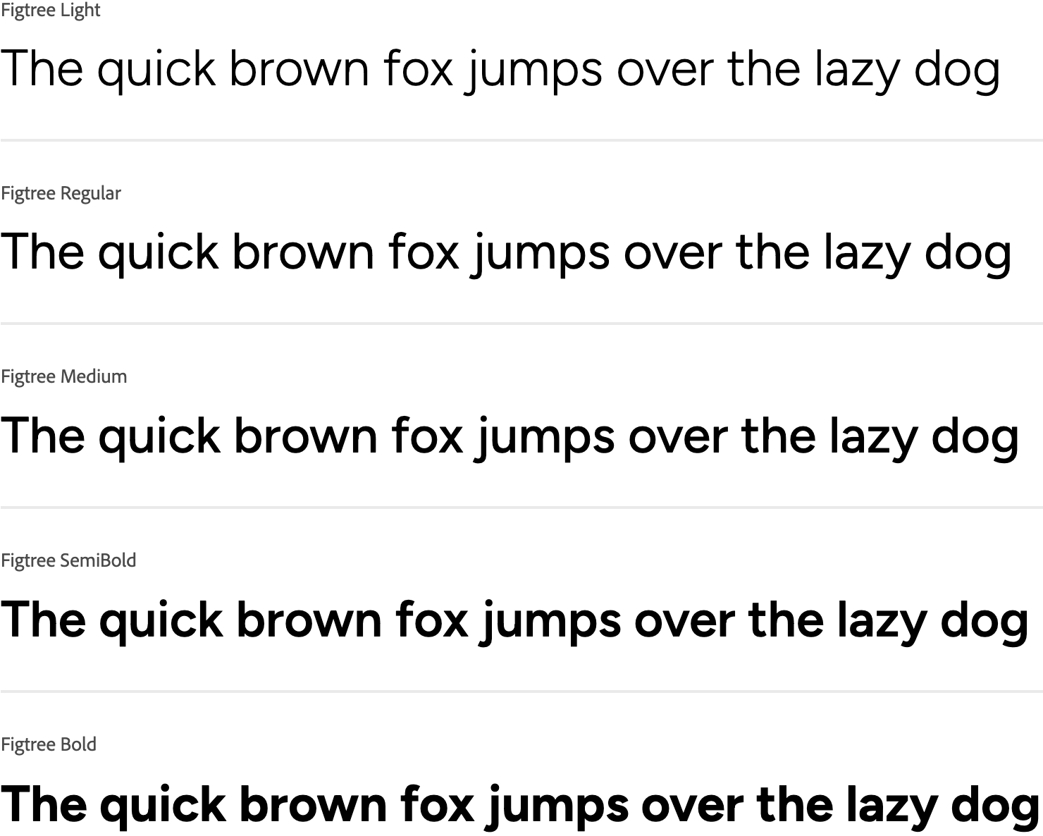
Together, the two typefaces create a cohesive system. Effra establishes brand authority at the logo level. Figtree complements the logo and branding while offering several font weight variations.
Brand Colours
A monochrome foundation of black and white was chosen for the logo to establish a clinical, professional tone. Because colours behave differently in digital versus printed formats, it was important to ensure the black used in print retained the same depth and clarity seen on-screen. Instead of relying on “true black,” which often prints as dull or washed out, a rich black (CMYK 63, 52, 51, 100) was selected. This blend uses small amounts of cyan, magenta, and yellow with a heavier black (K) value to produce a deeper, more saturated result that maintains a strong, consistent appearance across all printed materials.
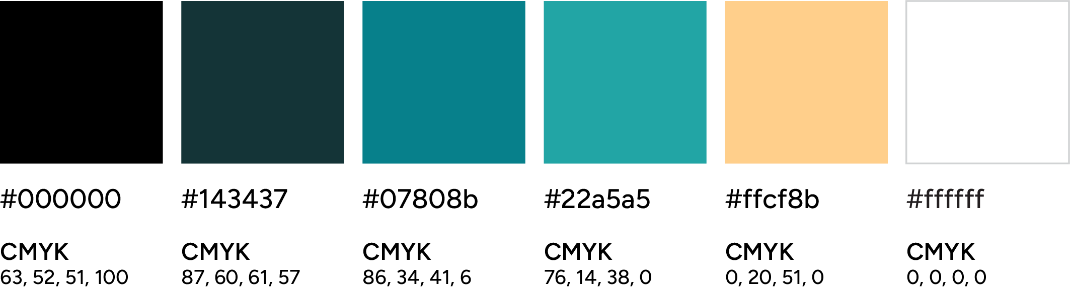
The chosen accent colours are deep blue/teal, lighter teals, and a soft warm sand. These were selected to balance clinical trust, brand personality and technical consistency across digital and print environments.
Blue is the most commonly used colour in healthcare. It communicates safety, cleanliness and reliability. However, blue tends to shift noticeably between digital and printed formats. Teal offered a more stable alternative. It maintains colour integrity in both RGB and CMYK while still providing strong contrast if used on labels or other print materials. It also naturally connects to the brand name, evoking the clarity and depth of Pacific ocean water.
The light warm sand colour was introduced as a subtle warmth to balance the cooler tones and support hierarchy. It also creates a more approachable, human feel without compromising the clean, clinical aesthetic of the overall brand.
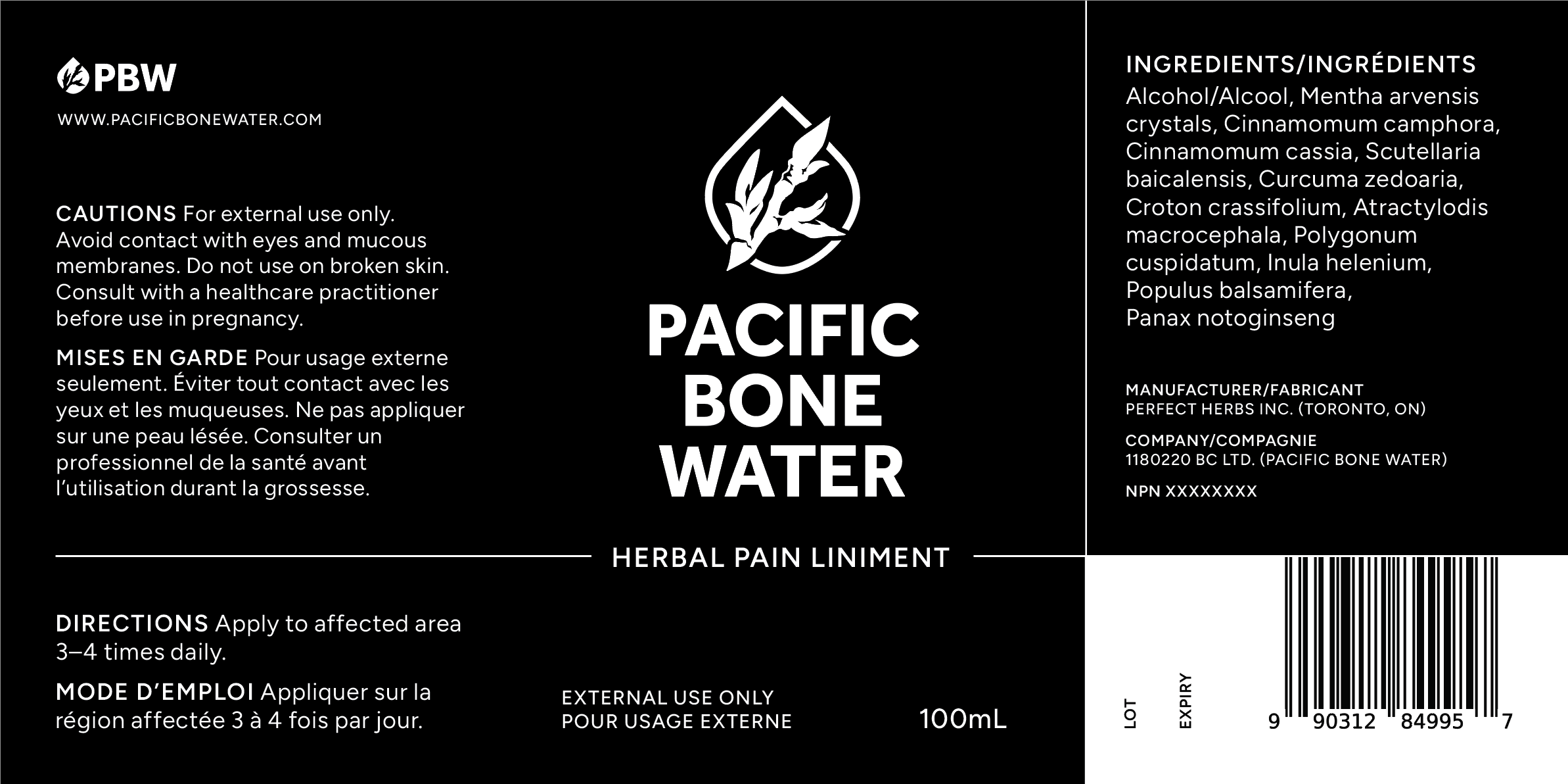
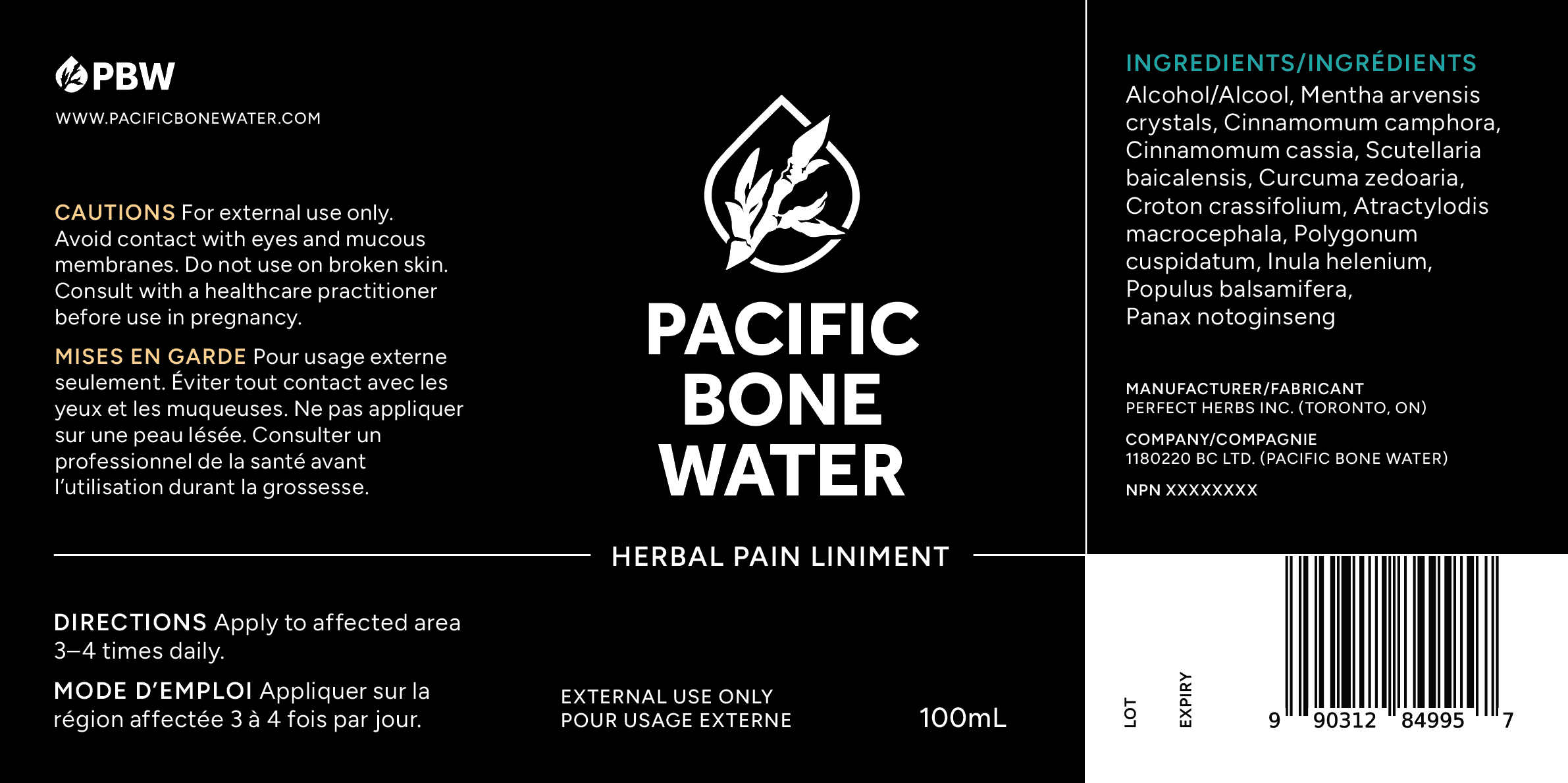
Label Design
The label is being designed to wrap around a 100mL Amber boston round glass bottle.
Key bilingual layout decisions include:
- A front panel focused on brand, product name and key identifiers
- A left panel for directions and cautions
- A right panel for ingredients, further product details and a barcode
- Clear hierarchy using font size, weight and spacing to prevent clutter while maintaining readability
- Label Design Loading 75%
The label design is in progress and awaiting final approval from Health Canada. This page will be updated with the finalized label design and product photos.
Product Label Design Concepts
Monochrome
With Colour

Let’s Work Together
& Build Your Beautiful Brand